Most charities can't segment their donor base weekly. We built Atlas to fix that.
The cohort report should be a thing you check daily, not a quarterly project that needs SQL and an analyst. Atlas runs every night across nine dimensions, refreshes the numbers, narrates what changed, and lands the biggest mover in your morning digest. Here is how it works.
Cause Shield
June 10, 2026·5 min read
Most charities cannot segment their donor base on a weekly cadence. The data exists. It sits in a CRM, a Stripe account, a fundraising platform, sometimes all three. But pulling a current cohort report needs either an analyst with SQL access or a paid analytics integration that the fundraising team cannot authorise on their own.
So the segment report happens quarterly. Sometimes annually. And in between, the development director is running a multi-million-dollar program on a snapshot of who the donors used to be, not who they are now.
We built Atlas to fix that.
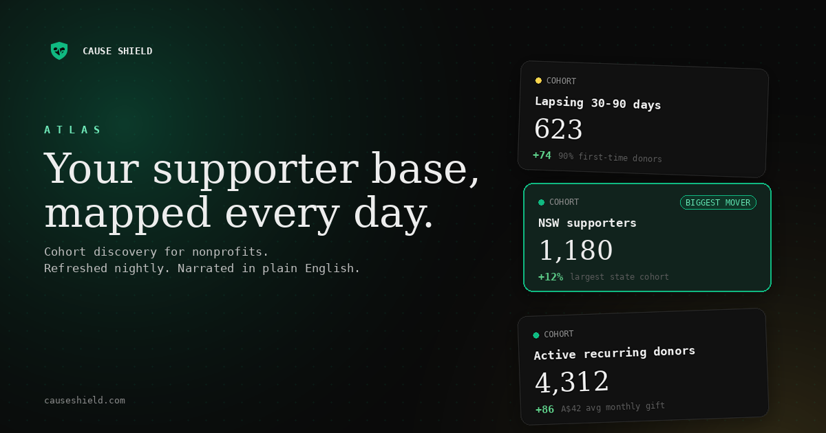
Atlas runs every night at 02:00 UTC. It looks across your supporter base on nine dimensions (recurring status, lifetime giving band, engagement intensity, channel mix, recency, risk history, age band, state, and country) and surfaces the cohorts that actually exist in your data. The next morning, the head of fundraising opens Cause Shield and sees today's reality, with a week-ago comparison, narrated in plain English.
No SQL. No dashboard configuration. No analyst time.
Cohorts, without the cohort building
Most analytics tools make you build the cohort first, then look at it. You decide what to ask. The data answers.
The problem with this order is that the questions you know to ask are the ones you have already asked. The cohort you did not know to build is the one that would have told you something useful.
Atlas inverts the order. Every night it sweeps your supporter table, finds the cohorts that have meaningful size, and shows them all on one screen. The fastest growing cohort in the last seven days is right there in the morning, ranked against everything else. Sometimes it is a cohort you would have eventually asked for. Sometimes it is one you would not have.
Demographic cards from any platform
The hard problem we had to solve to make this work for everyone is that fundraising platforms format their payloads differently. Funraisin sends date of birth in one shape. Raisely in another. Classy in a third.
Atlas ships hard-coded support for those three. For anything else, a weekly AI pass scans recent webhook payloads and learns where the demographic fields live, then caches the paths so subsequent ingest runs are free. The result: an Australian charity sees "NSW supporters: 1,180" on their dashboard without configuring anything. A UK charity sees their counties. A global org sees a top-five country breakdown. Nobody had to set it up.
If a field is not in the payload, the cohort does not appear. We do not invent data. The dimensions you see are the ones your platform actually sends.
Daily numbers, weekly deltas
This was the design decision we went back and forth on the most.
The obvious option is to refresh everything daily and compare against yesterday. The problem is that day over day deltas for a nonprofit are noise. Most charities have weekly giving patterns. Mondays and Tuesdays look like one thing. Saturday and Sunday look like another. A day over day comparison would be a sawtooth that does not mean anything to anyone.
So Atlas refreshes the cohort sizes every day, but the "what changed" number compares against your supporter base from seven days ago, anchored on a rolling baseline that rolls forward weekly. You get current data without the day over day noise that would turn the delta column into static. The first time you log in, the deltas are zero. By the end of week one, they are real.
Narratives, not pivot tables
Each cohort card carries a two sentence read on what the data shows. Which cohort grew the fastest. What its average gift looks like. How its recurring-active share compares to the overall base.
The model is instructed to lead with the most newsworthy fact and never speculate about cause. It describes what moved. It does not tell you why. That is deliberate. Cause inference is the part of the job we want a human fundraising professional doing, because they know things the data does not (the campaign that ran last week, the board member who shared something, the matched-gift program that started Tuesday). Atlas gives them the what so they can spend their judgment on the why.
The biggest mover lands in your daily digest
We did not want Atlas to become another dashboard nobody opens. So whichever cohort moved the most overnight is automatically spotlighted in your daily fraud and uptime briefing, the one your team already reads with their morning coffee. If something material happens, you will see it in your inbox without remembering to check.
This was the change that made Atlas useful in practice. The dashboard is there if you want to drill in. The digest tells you when there is something worth drilling into.
Who Atlas is for
Atlas is live today on every Partner-tier Cause Shield account. If you are already on Partner, log in and the cohort grid is in the dashboard nav under Atlas. The first scan will populate within 24 hours. If you are on Starter or Growth, you can upgrade and Atlas goes live the same day.
We built this for the fundraising teams who have been running a million-dollar program on a quarterly cohort report. The cohort report should be a thing you check daily, narrated for you, with no SQL, no analyst, no ask. That is what Atlas does.
See Atlas in the product tour, or start a 14-day Partner trial.
Tags